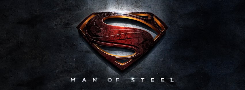
On the official Facebook for 'Man of Steel' the film logo was just released. It's a little darker and bit more gritty than we're use to seeing, and if I'm not mistaken, I think somebody stuck the Nike shoosh in the center! (probably just a coincidence) However, it's obvious some more creative alterations have taken place since the 2006 film. We may still have for the Summer before we get any footage or a trailer most likely with The Dark Knight Rises. In the meantime, it sounds like we should keep an eye on this Facebook page, as it looks like more will be hitting there soon.
Thoughts on the logo?


